About the client
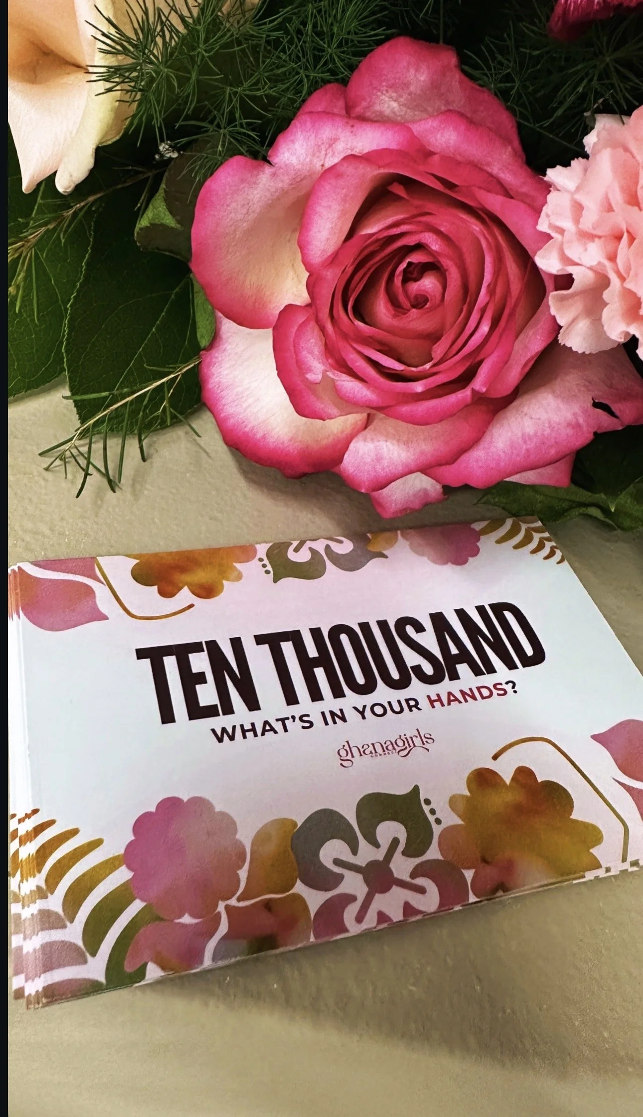
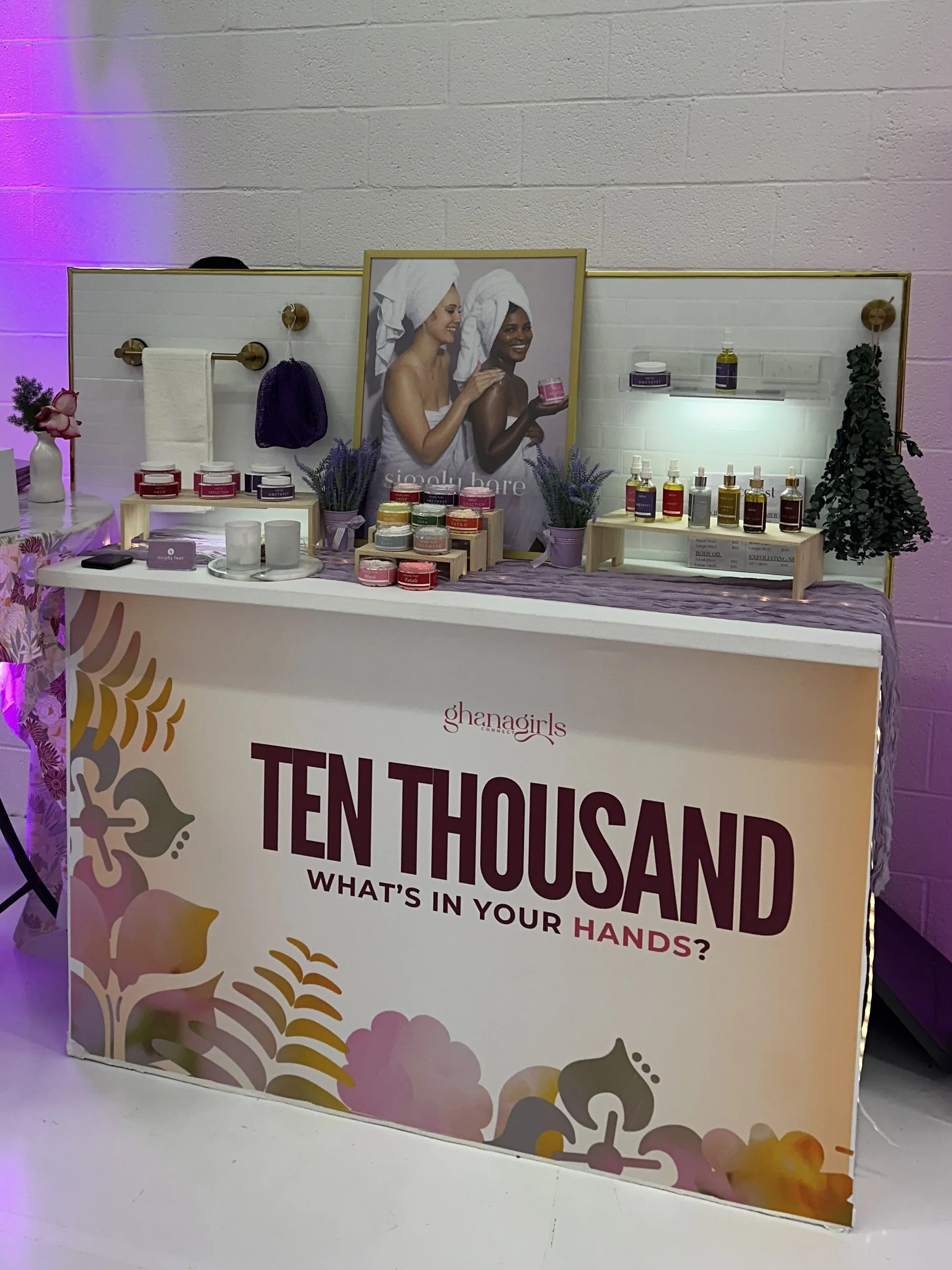
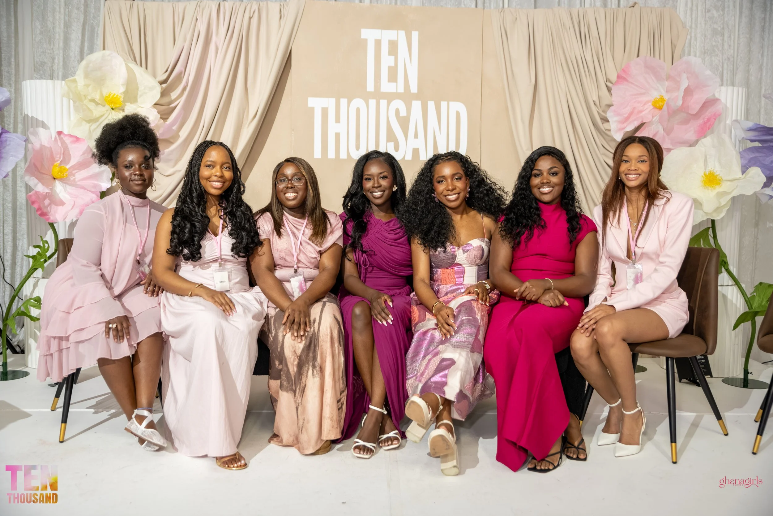
Ten Thousand is an annual brunch and networking conference produced by Ghana Girls Connect, a community organization centered on the healing power of professional sisterhood.
Now in its second year with the studio, this engagement built on an established creative partnership to bring a new theme to life from the inside out.
Scope of Work:
Brand Strategy
Creative Direction
Brand Event Experience
Brand Strategy
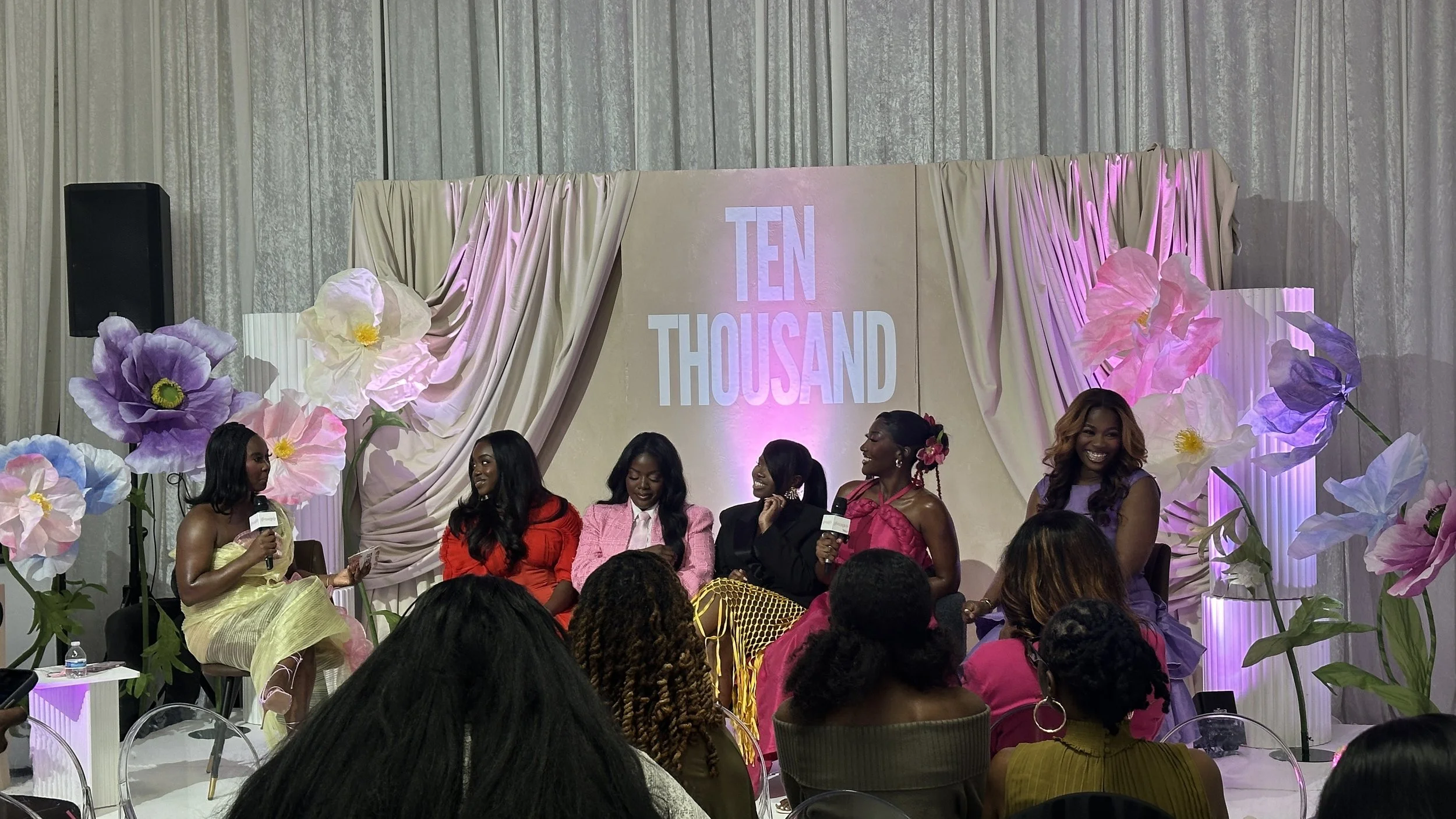
The 2026 edition of Ten Thousand was built around a single question: what is already in your hands? The central premise was that creativity is not a personality type or a professional title. It is something every person in the room already carries, whether they have named it yet or not. The studio's strategic work began there, and everything that followed was built to make that premise felt rather than just heard.The first task was giving the theme a structure that attendees could actually see themselves inside of. The result was a five-part framework called the Creative Types, a set of profiles that map how people express and experience creativity in their own lives. The Visionary. The Builder. The Messenger. The Refiner. The Connector. Each type was developed with its own emotional language, its own Adinkra symbol drawn from Ghanaian cultural tradition, its own scripture anchor, and its own career alignment. The framework was not decoration. It was the strategic spine of the entire event.
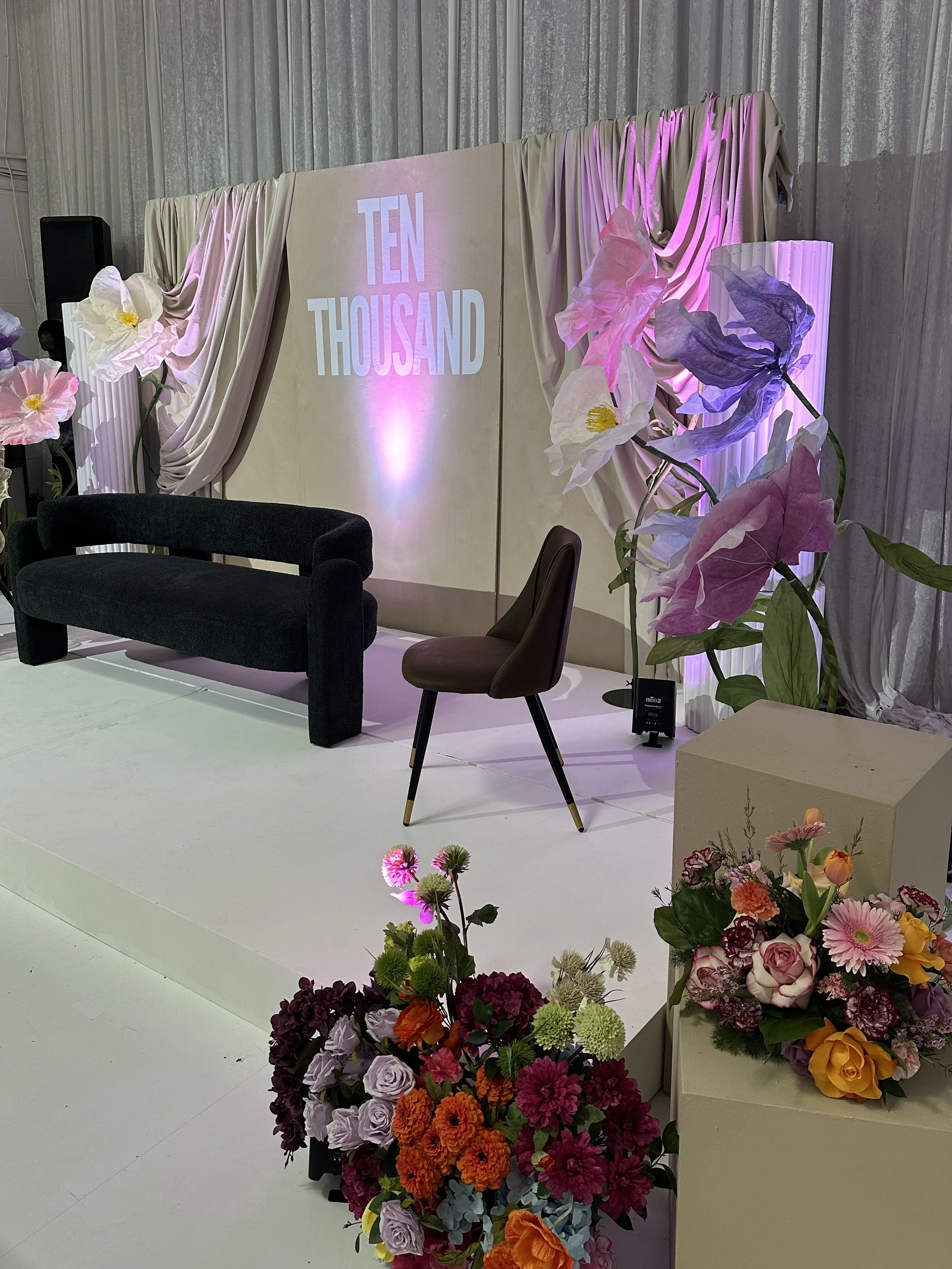
Creative Direction
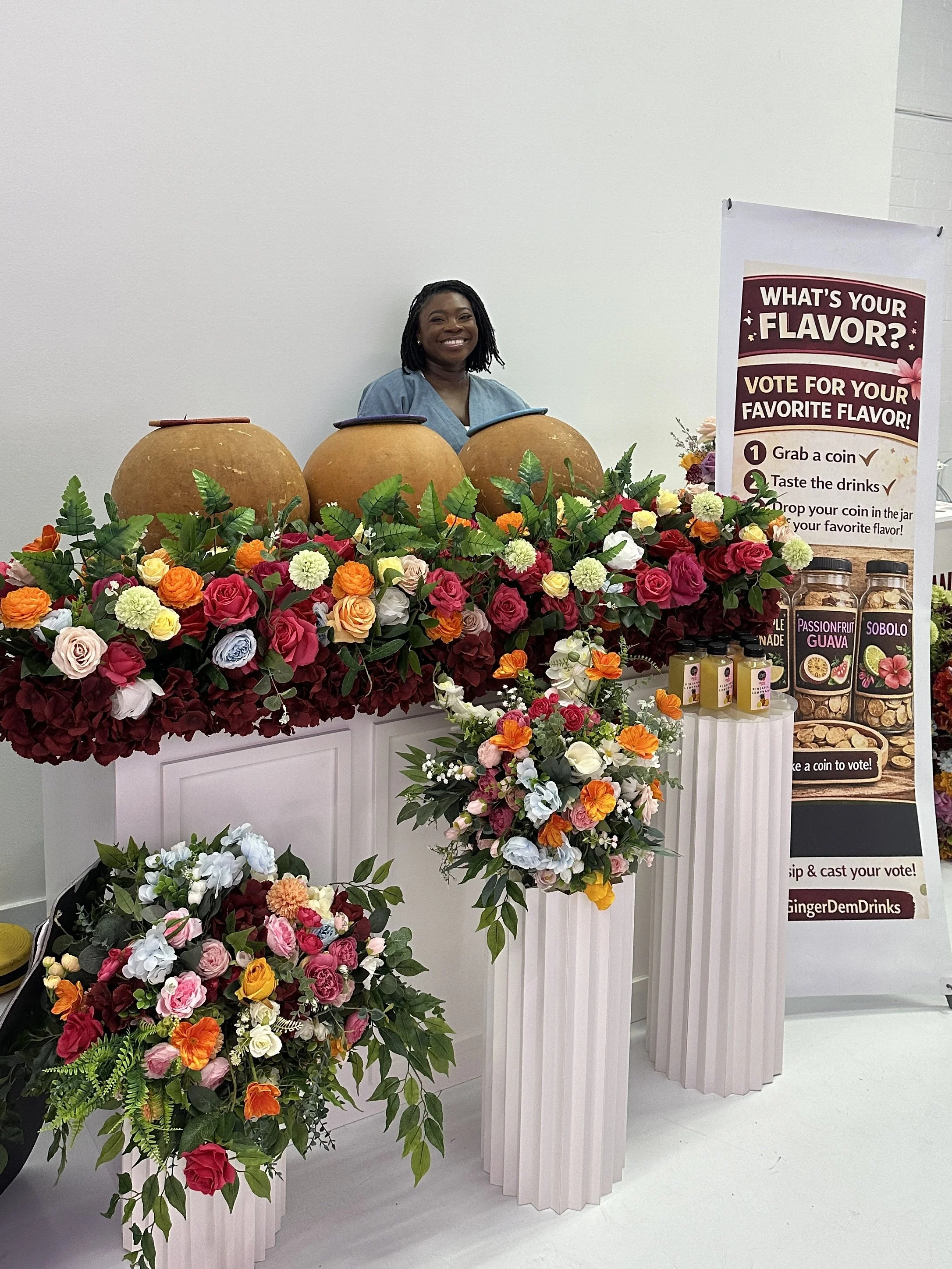
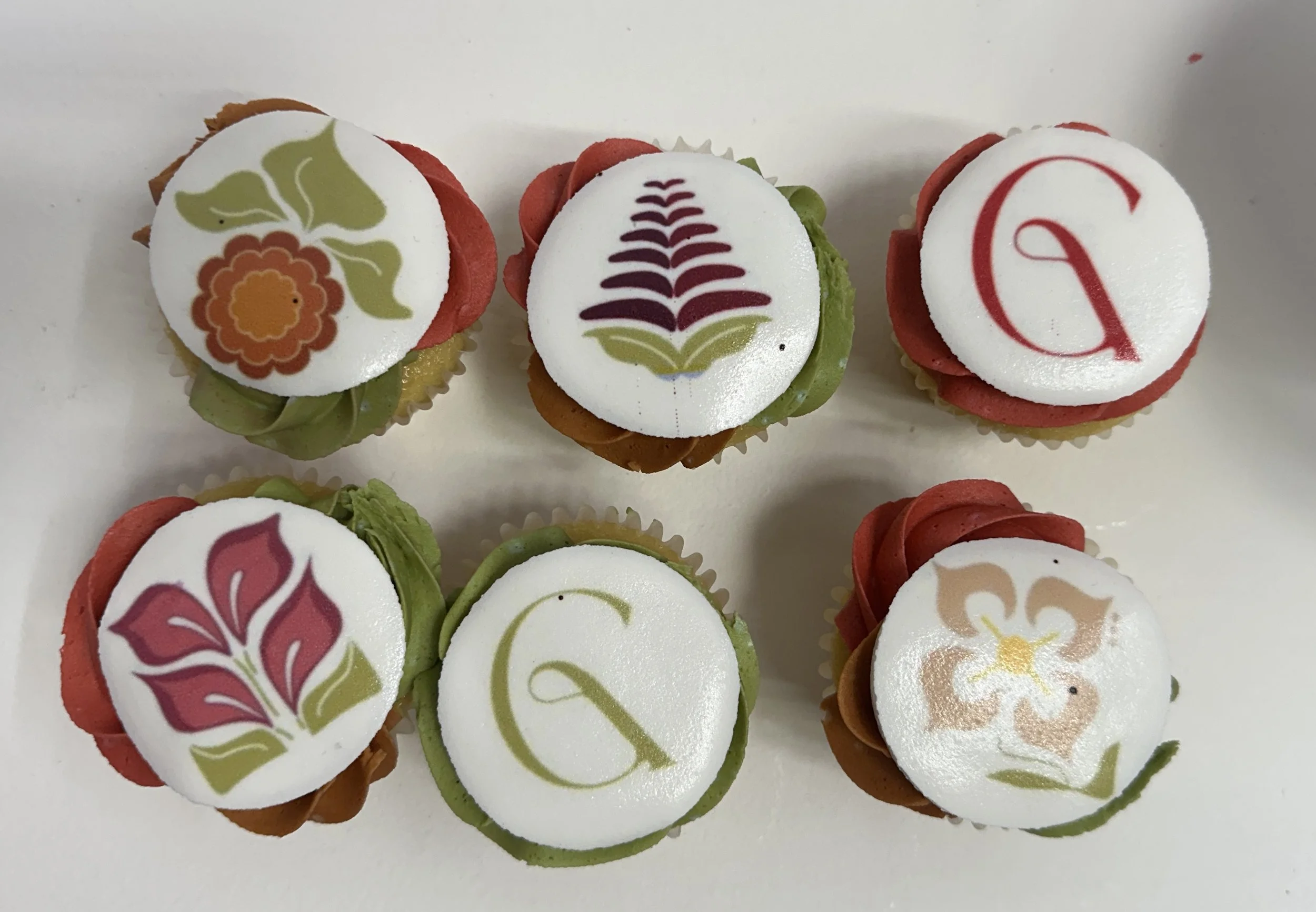
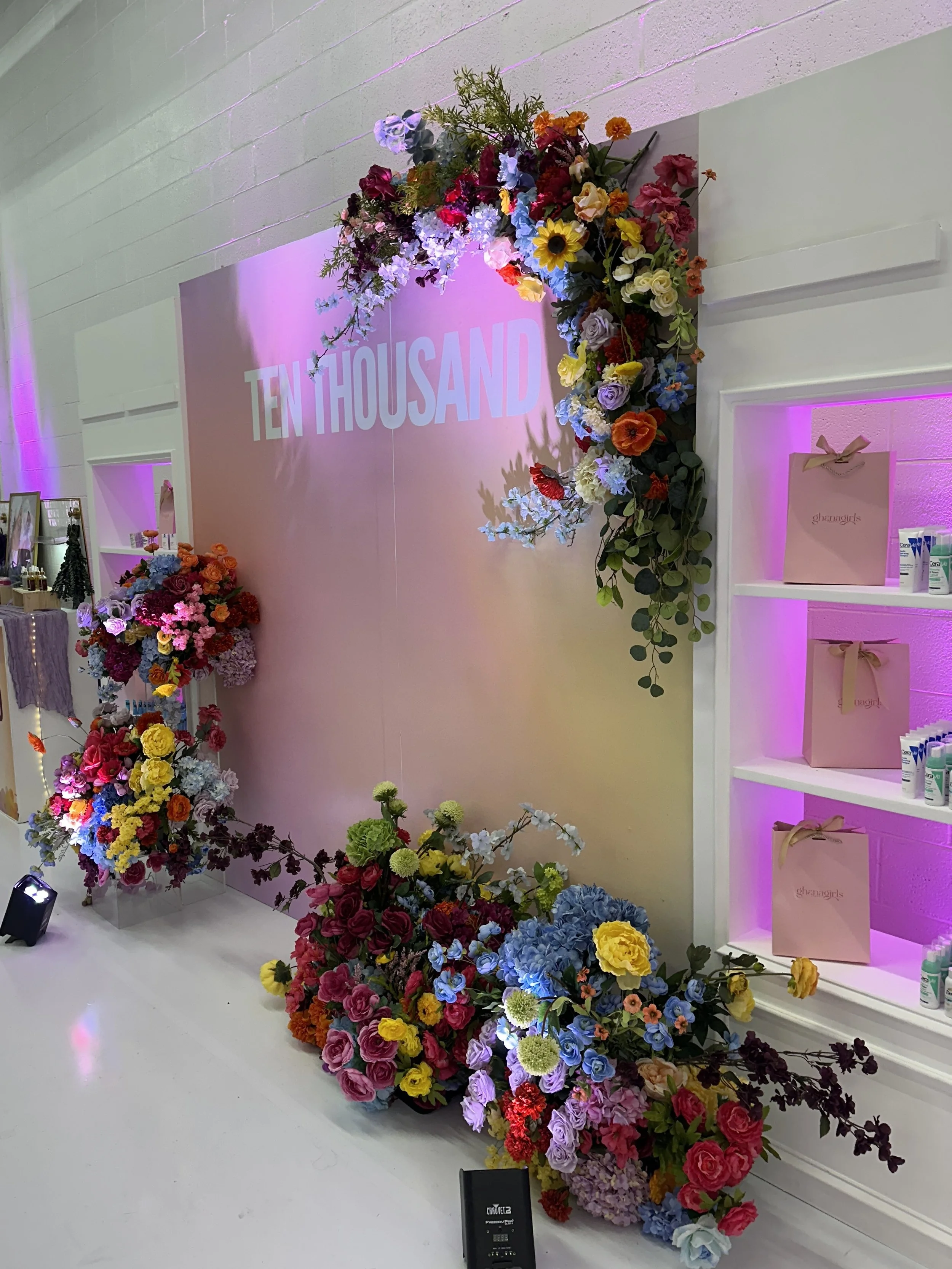
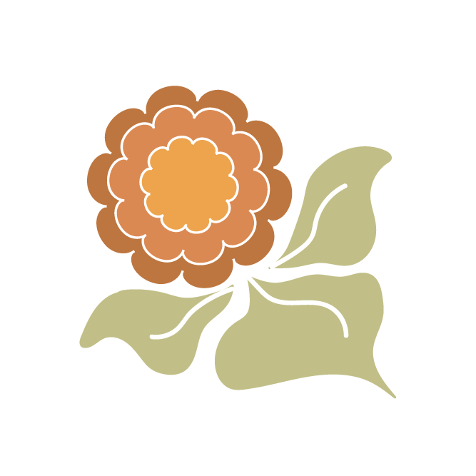
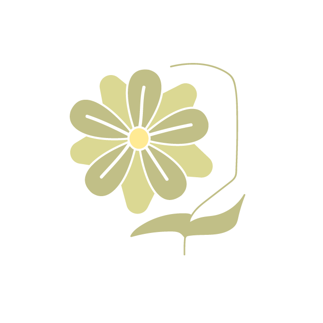
With the framework in place, the creative direction shaped how the theme would live in the space itself. A gradient, airy aesthetic that felt warm and expansive rather than polished and distant. A color palette where each hue was chosen to carry the emotional weight of the type it represented, the Visionary in a warm radiant orange, the Builder in a deep steady plum, the Messenger in an expressive rose, the Refiner in a grounded sage, and the Connector in an open periwinkle. The Adinkra symbols were translated into a custom botanical graphic system that gave each type a visual identity of its own while holding together as a cohesive whole. The visual language was designed to be something you could feel before you read a word.

Brand Experience
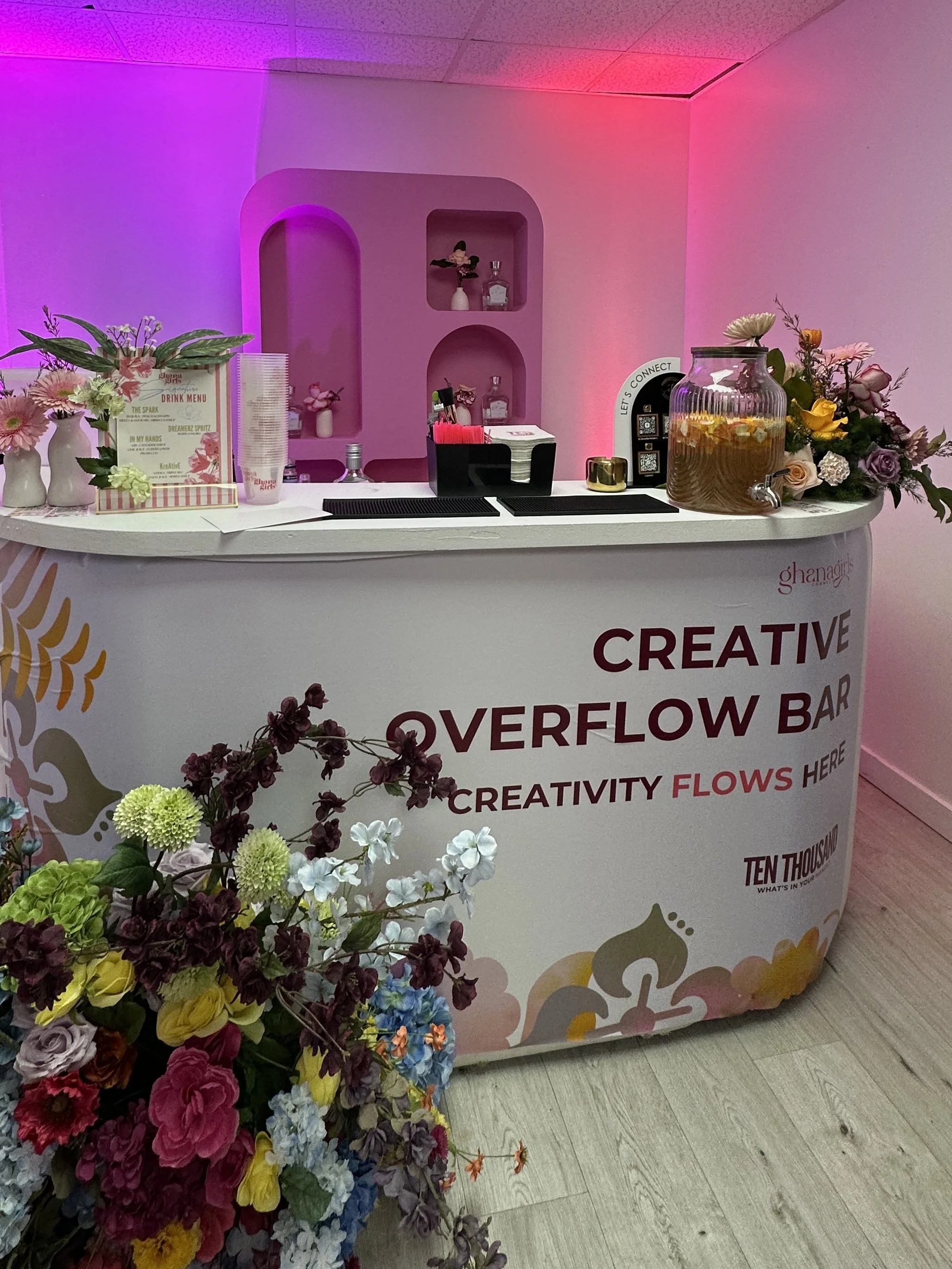
The experience design extended the framework across every touchpoint of the event. Each activation was built to correspond to a specific creative type and a specific question the theme was asking. The Dream Deposit Vision Wall for the Visionary. Blueprints in Bloom for the Builder. The Speak Life Studio for the Messenger. The Remix Lab for the Refiner. A Purpose Pairings connection mixer for the Connector. Every station was designed so that the act of participating in it was itself an answer to the question the event was asking.
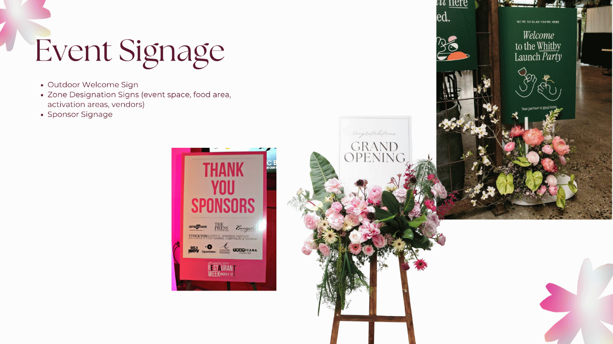
The guest experience, the stage environment, the signage, the identification, the dining details, each element was considered through the same lens. Not what looks cohesive, but what communicates the right thing to the right person at the right moment. Because an event brand is not just a visual system. It is a meaning system. And when the meaning is clear from the beginning, every decision that follows has somewhere to come from.